Pros and Cons to Different Flooring Types

When it comes to flooring, there are lots of different choices, each with their own benefits. Below, we’ll outline those benefits, and other things to consider, when choosing flooring for different rooms in your home. 

PLEIADES-FINAL(28of55).jpg

Hardwood

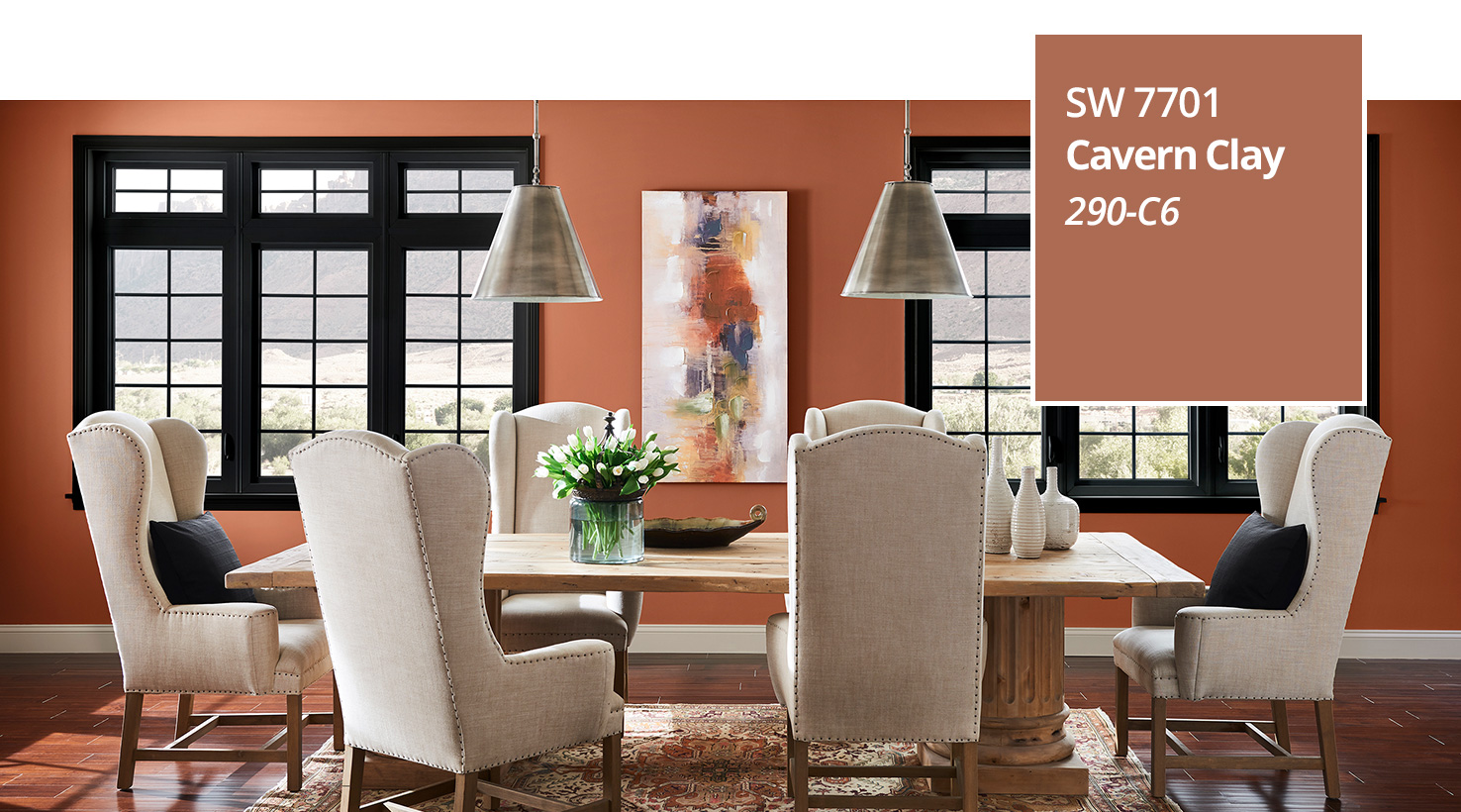
Hardwood flooring is a durable option that can last for many many many years. Hardwood can be sanded and refinished multiple times, making it look new again. Wood planks come in a variety of widths, wood species, textures, and colors, making it easy to coordinate with your design. Different species of wood have different hardness, so you'll want to choose one that can withstand the amount of foot traffic in that room. Hardwood is best for shared living spaces on the first floor- living, family, dining room.


Engineered Wood

Engineered wood is a more affordable alternative to solid hardwood. It looks like hardwood, but is more resistant to moisture. Engineered hardwood is a good choice in areas of your home where you might be concerned about true hardwood warping due to high humidity levels, such as in a basement. One drawback to engineered wood is that it’s not able to be sanded down or refinished as frequently as you could with true hardwood floors because of the thin top veneer. You can refinish one to three times depending on the thickness of the top layer.


Halliwell Dr.-MLS-7.JPG

Laminate

If you love the look of hardwood, but can’t fit it into your budget, laminate flooring might be a good choice. Laminate doesn’t have a real wood top layer and cannot be refinished. Instead, it’s an image captured using photo-realism technology, covered in a thick plastic coating. Laminate is sturdy and durable, and looks almost identical to the real thing for a fraction of the cost. It is best used in high traffic areas that don’t see a lot of moisture.


Luxury Vinyl Plank (LVP)

LVP is a durable, waterproof option (great for kitchens and baths) that is affordable and typically easy to install. It’s soft underfoot and easy to maintain. It is also scratch resistant, which is great if you have kids or pets. LVP is available in a variety of colors, finishes, textures and sizes to coordinate with your space. The con for LVP is you can’t refinish these floors if they’re scratched. You can replace boards if you order extra (highly recommend).


GILBERTSTREET(47of55).jpg

Tile

Ceramic or porcelain tile is one of the most versatile flooring types. Its many colors, textures, shapes, and sizes make it an option that could coordinate well with any room in your home. It’s important to choose tiles that are rated for use on floors to ensure they will stand up to foot traffic. Tile is great for wet areas- entry/mud room, kitchen, bathrooms.


Carpet

Carpet is another versatile option. It comes in many different colors, textures and materials. Carpet provides a soft, warm surface and helps with dampening noise. Durability depends on the fiber density count- the more fibers it has per square inch, the more durable it will be. Carpet is typically a good choice for bedrooms. Great for a budget but can be hard on allergies.

Which flooring suits your home best? Let us know!

Decorating For Spring

Spring is almost here! I love the change of seasons and the optimism it brings. The longer days, warmer weather, and beautiful colors inspire me to start fresh and tackle my to-do list. A new season is also a great time to switch up your décor. Add bursts of bright color, energetic patterns, and lively springtime motifs to your home to effortlessly transition it into spring. Freshen up your space for the season and give your home (and yourself) a mood makeover with these ideas:

IMG_6593.JPG


Choose a springy color palette 

One of the easiest ways to change the look and feel of a space is to paint. Choose a springtime color such as a soft violet or cerulean, and paint the whole room, or even just an accent wall. Choose accessories, curtains, and upholstery to coordinate with your new wall color and it will feel like a brand new room.


Decorate with florals and greenery 

Artwork, throw pillows, bedding, and curtains with a colorful floral or bold green leaf print, as well as succulents, greenery, and flowers in a fun vase, will bring spring into your home, making it feel fresh, bright and cheery.


Choose light, airy fabrics 

When switching out your bedding, throw pillows and curtains, opt for lightweight, seasonally appropriate fabrics such as linen and cotton. These fabrics will help lighten up your space and make the room feel fresh and comfortable.

IMG_6591.JPG


Add an eye-catching area rug 

Choose a coordinating area rug with a fun color and pattern to complement your décor and add some softness to the space. It’ll also provide some warmth for those chilly early spring nights.


Decorate with nature-inspired materials

Create a relaxing space to unwind in by using items made with natural materials such as sisal, wicker, grasscloth, and wood. These materials add texture and create a cozy, casual feel- perfect for relaxing.


A few simple changes in your décor can make your home feel fresh and new again. What is your favorite way to decorate your space for Spring?


2019 Color of the Year

As a home stylist, designer, and artist, I love color. Color can change the way a space not only looks, but also how it feels. If you’re considering a new paint color, take a look at these colors from Sherwin Williams and Benjamin Moore.  Both companies recently announced their Color of the Year for 2019 and I’m in love!

SW2019coloroftheyear.jpg

Sherwin Williams’ 2019 Color of the Year is Cavern Clay (SW 7701), a warm terracotta. This warm hue brings the outdoors in and adds a nice pop to any space. The Sherwin Williams website describes this color as “a nod to midcentury modern style, but with the soul of the American Southwest, which together creates a desert modern aesthetic.”  This earthy hue is both casual and refined, and looks great with stone, leather, woodgrain and greenery.  If you love all things earthy, southwest or bohemian, then this color is for you!  It pairs beautifully with neutrals such as warm gray or deep brown.

benjamin-moore-color-of-the-year-1539272345.jpg

If warm, earthy tones aren’t your thing, on the opposite end of the spectrum is Benjamin Moore’s 2019 Color of the Year, Metropolitan (AF-690), a cool gray. Benjamin Moore’s website says it “emanates nuance, harmony and extravagant ease. Always adaptable, it softens to matte or shimmers with sheen. It's neutral. It's understated. It just is. This is color, off-duty." This neutral, soft gray is “calm, composed, and effortlessly sophisticated.” It’s the perfect backdrop for almost anything.  Layer it with other neutrals to create a soft, modern feel, or pair it with navy or blush tones and metallic accents for something a little bolder, but still modern and sophisticated.

As much as I love the color and warmth of Cavern Clay, the cool, neutral hue of Metropolitan is more my style. Which one is your favorite?

- Kerri

What Not To Do When Creating A Gallery Wall

I didn't realize some of these frames were crooked until I was editing. The perfectionist in me is literally twitching, haha

I didn't realize some of these frames were crooked until I was editing. The perfectionist in me is literally twitching, haha


     I had every intention when we started this gallery wall that I was going to write this fabulous "How-To" for big gallery walls. Um, three days and roughly eight collective hours later, I realized I was so naive. So just like How To Lose A Guy In 10 Days, I'm reverse how-to(ing) this. 

    I started this process quite awhile before we purchased anything for it. I'd like to think I did the first few steps correctly. I picked a frame that was simple and would be uniform across the entire wall. I picked a few big pieces that we would work around. Finally, waited for wedding photos before beginning because I knew I wanted it to be all about us. 

    Then, Michaels had a HUGE sale on the frames I wanted. We went to two separate stores and still ended up with two different colored frames. A dark wood and a white. I decided to come to terms with this, even though I knew I will eventually want all the same shade. Luckily, the Belmont frame from Michael's doesn't seem to be going anywhere anytime soon. 

    So, now that we've cleaned out both of the Michael's of their remaining white and dark wood frames, we headed home happy. Ok, I was happy. Alvin was agitated that he went to decor stores after a work day. As soon as we got home, the high of the deals had me instantly moving our coffee table to make room on the floor to start creating the layout. 


Creating the layour was messy work. 

Creating the layour was messy work. 


    After creating a beautiful layout that I adored while it was on the floor, I measured the width and height to give us some parameters on the wall. We used painters tape to mark the height parameters but I decided pretty quickly that I wanted the gallery to be a bit wider than it was on the floor. In my excitement/Friday night exhaustion, I didn't think through the problems widening it might cause. This is mistake #1


IMG_8548.jpg


    So we put them all up, roughly where they were on the floor. I say roughly because mistake #2: we didn't measure between the frames as they were on the floor. Not that it would have mattered since I widened the space anyway. Are you following this domino effect of mistakes?  


All the frames at the bottom were driving me nuts! 

All the frames at the bottom were driving me nuts! 


    Frustrated and tired, we call it a night. In the morning, it becomes obvious that there are weird gaps that weren't there before. That afternoon, I try rearranging it a bit. Just moving frames a bit to the left here, a bit to the right there. But overall keeping the same design as had been on the floor. Mistake #3. I should have realized that the shape on the floor only looked that good because of the width parameters. The only thing we accomplished on day two was creating lots and lots of little holes in our wall. Seriously, it looks like someone took a machine nail gun to it.  


End of day 2, contemplating my life decisions. JK, I was trying to solve the puzzle.

End of day 2, contemplating my life decisions. JK, I was trying to solve the puzzle.


    So on day three, I decided I still loved the height. And I picked two edge frames that I wanted to be the furthest points. Then we moved nearly everything else around. We ended up with two fewer frames than originally intended because once it was on the wall, I liked having the negative space. Here's the final product! 


So what can you learn from this post? 

1) Don't take shortcuts. We were so tired we thought we'd just hang them up "roughly" where they were on the floors (Actually this was Alvin but he was doing the hanging so I didn't want to fight him on it). Taking this "shortcut" ended up costing hours in rearranging times.

2) Use tape to mark parameters or even the shapes of each individual frame. It would have taken quite a bit of time to use tape to mark each individual frame (we have sixteen on this wall) but it's also going to take quite a bit of time to fill in all those holes from us moving the frames around.

3) Do your style research. I had a hard time finding a similar gallery wall to mine, in that we used clean modern style frames but did a large asymmetrical layout. However, if you're interested in a mismatched farmhouse wall or a super clean uniform wall, there are a lot of examples out there that you can browse through. Find what you do and don't like before starting to hang things. 

4) Don't be afraid to rearrange it. Sure, you may end up with a few holes. But those can be patched up! Accept that you made a mistake the first (or fourth) time around and just tweak it until you're satisfied. 

5) Know when to stop. This is especially tricky for perfectionists like me working on an asymmetrical gallery wall. Just know, that it's probably never going to be "perfect". But once it looks pretty to you, stop. Then just enjoy your beautiful work and photos! 


Shoutout to our wedding photographer Erin, of Luxe & Pine! We adore our photos so much we spent hours working on a gallery wall because we couldn't narrow down any further which ones we wanted framed and up on the wall!