2020 Colors of the Year
/
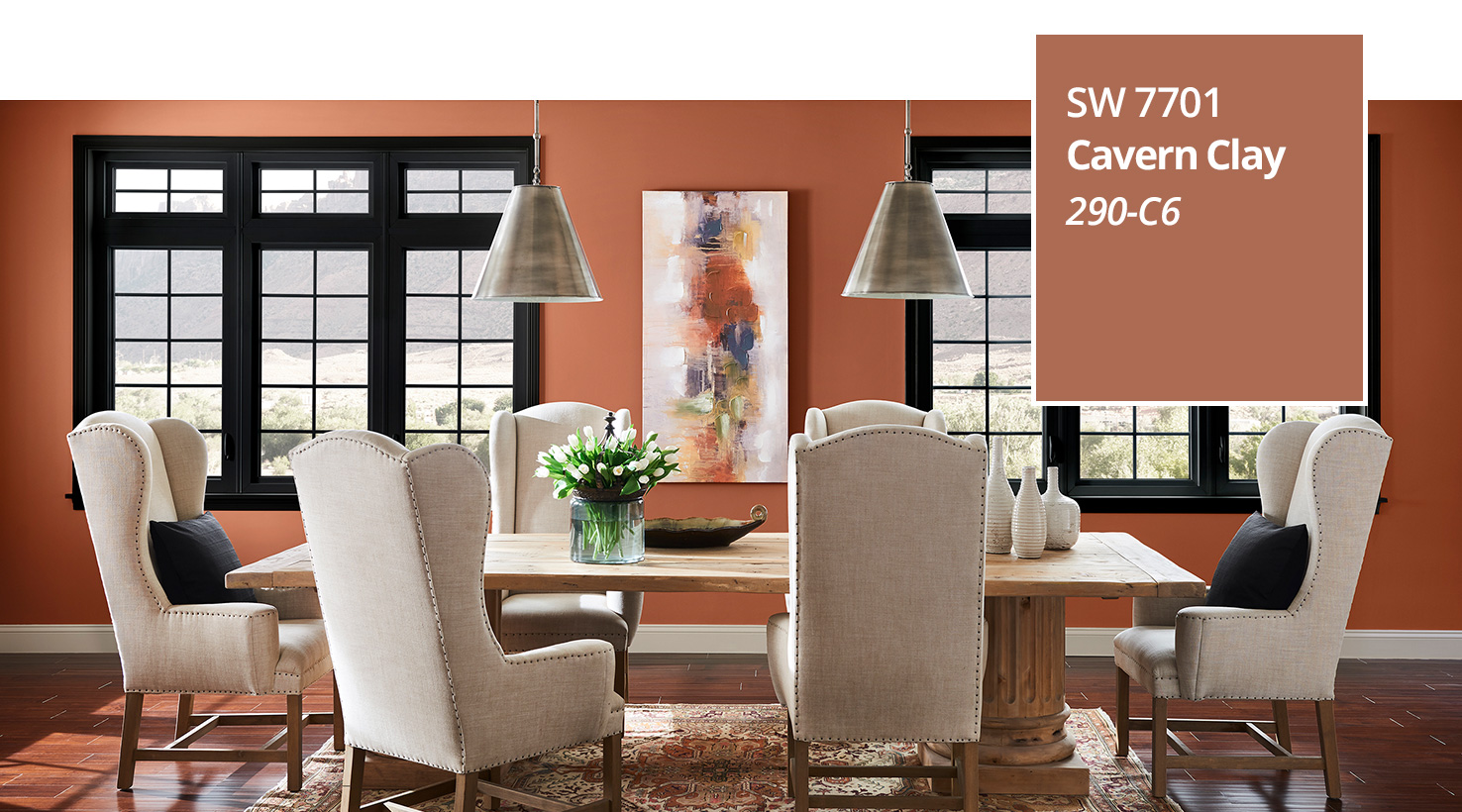
Source: Sherwin Williams
Sherwin Williams has released their pick for 2020 Color of the Year and I’m super excited about it! Naval (SW 6244) is a “rich navy that creates a calm and grounding environment infused with quiet confidence.” I’ve been digging navy for a while now and I can’t wait to see more of it used in design, furniture, and decor. It’s a great, bold neutral, and it pairs well with gold accents, white marble, and greenery.
As described on the Sherwin Williams’ website, “Giving a nod to Art Deco influences, Naval fuses the striking and bold opulence of Art Deco with the awe‑inspiring power of nature – from the infinite night sky to the mysterious depths of the sea – bringing navy out of its comfort zone to usher in an empowering new year and fresh decade of change. This deep shade evokes a prominent sense of confidence that fuses timeless color with a fresh mix of natural materials and textures that bring navy blue into a new era.”
If you’re on the fence about using such a bold color on your walls, check out the tips in our newsletter for ways to incorporate navy into your home in a more subtle way.

Source: Benjamin Moore
On the opposite end of the spectrum is Benjamin Moore’s choice for 2020 Color of the Year. They picked First Light (2102-70), a “soft, rosy hue blooming with new potential. The backdrop for a bright new decade.” It’s described as “A refreshing alternative to white or beige, First Light is a soft, airy pink that flatters any space and plays well with other colors.” Pair this uplifting color with gold accents, light wood, and greenery to keep the overall feel light and bright.
I think pairing these two colors would look amazing! Which one do you like best?
- Kerri