What Not To Do When Creating A Gallery Wall

I didn't realize some of these frames were crooked until I was editing. The perfectionist in me is literally twitching, haha

I didn't realize some of these frames were crooked until I was editing. The perfectionist in me is literally twitching, haha


     I had every intention when we started this gallery wall that I was going to write this fabulous "How-To" for big gallery walls. Um, three days and roughly eight collective hours later, I realized I was so naive. So just like How To Lose A Guy In 10 Days, I'm reverse how-to(ing) this. 

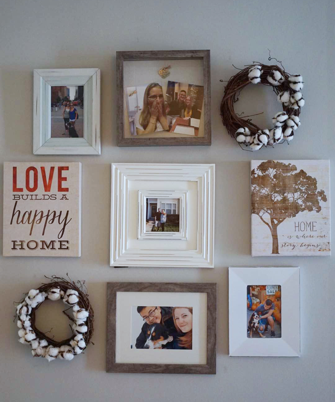
    I started this process quite awhile before we purchased anything for it. I'd like to think I did the first few steps correctly. I picked a frame that was simple and would be uniform across the entire wall. I picked a few big pieces that we would work around. Finally, waited for wedding photos before beginning because I knew I wanted it to be all about us. 

    Then, Michaels had a HUGE sale on the frames I wanted. We went to two separate stores and still ended up with two different colored frames. A dark wood and a white. I decided to come to terms with this, even though I knew I will eventually want all the same shade. Luckily, the Belmont frame from Michael's doesn't seem to be going anywhere anytime soon. 

    So, now that we've cleaned out both of the Michael's of their remaining white and dark wood frames, we headed home happy. Ok, I was happy. Alvin was agitated that he went to decor stores after a work day. As soon as we got home, the high of the deals had me instantly moving our coffee table to make room on the floor to start creating the layout. 


Creating the layour was messy work. 

Creating the layour was messy work. 


    After creating a beautiful layout that I adored while it was on the floor, I measured the width and height to give us some parameters on the wall. We used painters tape to mark the height parameters but I decided pretty quickly that I wanted the gallery to be a bit wider than it was on the floor. In my excitement/Friday night exhaustion, I didn't think through the problems widening it might cause. This is mistake #1


IMG_8548.jpg


    So we put them all up, roughly where they were on the floor. I say roughly because mistake #2: we didn't measure between the frames as they were on the floor. Not that it would have mattered since I widened the space anyway. Are you following this domino effect of mistakes?  


All the frames at the bottom were driving me nuts! 

All the frames at the bottom were driving me nuts! 


    Frustrated and tired, we call it a night. In the morning, it becomes obvious that there are weird gaps that weren't there before. That afternoon, I try rearranging it a bit. Just moving frames a bit to the left here, a bit to the right there. But overall keeping the same design as had been on the floor. Mistake #3. I should have realized that the shape on the floor only looked that good because of the width parameters. The only thing we accomplished on day two was creating lots and lots of little holes in our wall. Seriously, it looks like someone took a machine nail gun to it.  


End of day 2, contemplating my life decisions. JK, I was trying to solve the puzzle.

End of day 2, contemplating my life decisions. JK, I was trying to solve the puzzle.


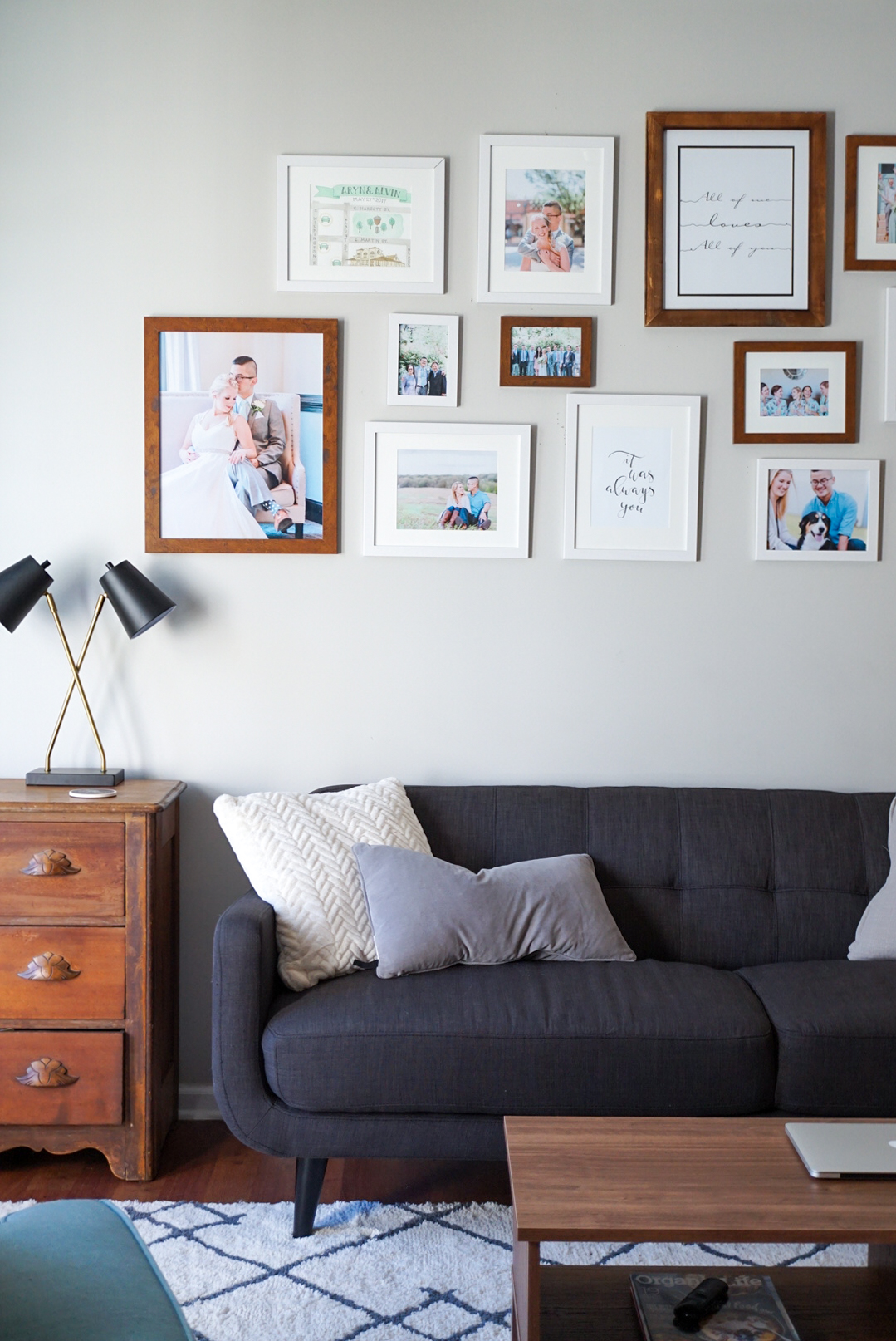
    So on day three, I decided I still loved the height. And I picked two edge frames that I wanted to be the furthest points. Then we moved nearly everything else around. We ended up with two fewer frames than originally intended because once it was on the wall, I liked having the negative space. Here's the final product! 


So what can you learn from this post? 

1) Don't take shortcuts. We were so tired we thought we'd just hang them up "roughly" where they were on the floors (Actually this was Alvin but he was doing the hanging so I didn't want to fight him on it). Taking this "shortcut" ended up costing hours in rearranging times.

2) Use tape to mark parameters or even the shapes of each individual frame. It would have taken quite a bit of time to use tape to mark each individual frame (we have sixteen on this wall) but it's also going to take quite a bit of time to fill in all those holes from us moving the frames around.

3) Do your style research. I had a hard time finding a similar gallery wall to mine, in that we used clean modern style frames but did a large asymmetrical layout. However, if you're interested in a mismatched farmhouse wall or a super clean uniform wall, there are a lot of examples out there that you can browse through. Find what you do and don't like before starting to hang things. 

4) Don't be afraid to rearrange it. Sure, you may end up with a few holes. But those can be patched up! Accept that you made a mistake the first (or fourth) time around and just tweak it until you're satisfied. 

5) Know when to stop. This is especially tricky for perfectionists like me working on an asymmetrical gallery wall. Just know, that it's probably never going to be "perfect". But once it looks pretty to you, stop. Then just enjoy your beautiful work and photos! 


Shoutout to our wedding photographer Erin, of Luxe & Pine! We adore our photos so much we spent hours working on a gallery wall because we couldn't narrow down any further which ones we wanted framed and up on the wall! 

What's Up Wednesday: Style With Confidence

     Boy have we been busy! I haven’t had the time to devote to this blog as I would like. So I don’t have any well researched piece for you today. Instead, I thought I would give you a glimpse into what I’m working on and give you tips on how to do it yourself.

     I have a super fun home styling project I’ve been working on this past month. This family is practically starting from scratch and hired me to help them make the few pieces they do have match the look that they want to end up with. Their old pieces are pretty traditional while they want to steer towards a modern boho feel. I swoon!

Step 1: Create A Mood Board On Pinterest

     Luckily, this client had already started the first step, which is to create a Pinterest board for each room. This helps you find patterns in the things you’re drawn to. Hopefully this will help you and/or your stylist know which direction to go once it comes time to purchase new pieces. 


For privacy reasons, I did not share the client's board. This is a board I quickly created as an example.

For privacy reasons, I did not share the client's board. This is a board I quickly created as an example.

       In my example, you'll probably notice some recurring themes and colors. Obviously grey sectionals have my heart. Other common pieces are white faux fur pillows, ivory rugs, and minimalism. Three out of four shown inspiration photos have plants. Three out of four have modern coffee tables. Three out of four have simple gallery walls. These are the types of patterns you can use when creating your room idea boards.

Step 2: Create A Room Idea Board

     After thoroughly studying the client's Pinterest boards, I created some room idea boards on Polyvore. It’s not a perfect format but I find it easy to use and I love that if they love something you have on the board, it includes links on where to buy it. I’m sharing the sunroom board because A) I just adore the feel of it and B) They did too and ended up buying nearly everything in it.


     These idea boards are also great for referencing when you’re out and about and stumble upon something you love! If you aren’t sure how it would fit into the space you’re working on, you can simply pull up the board and compare it to the pieces/feel you have going. It seriously cuts back on the impulse buying and helps those who are unsure how something in the store will suit their room.

Step Three: Search For The Pieces

     Final step: Shopping! And lots of it! These boards are a reference point, but you may not love everything in them. For the dining room, the client loved the feel of the board but we ended up purchasing different chairs for seat comfort. You'll also probably want a bit more than what's in the board. These are reference points, not final rooms. 

    Here's a list of the places I suggest this client shop in order to create the modern boho feel in her space. She doesn't like a "matchy matchy" look, which makes bargain hunting perfect! But it still allows for a few splurges. 

Stores I recommended to achieve this style:

Port of Raleigh

Zartiques

Wayfair

Craigslist

Facebook Marketplace

Target 

HomeGoods

     Hopefully by following these three steps, you can confidently revamp any space! Or if you’re not the DIYer when it comes to revamping your space, you could always hire a stylist to help you!

First Friday At Gather Goods

Around here, we love First Friday. I'm pretty sure towns all around have similar concepts. A certain night of the month dedicated to celebrating local art and small businesses. Such a great concept! Alvin and I try to make it out to First Friday as often as possible. We had an especially good First Friday this October.

A quaint local shop, Gather Goods Co., had a DIY cotton wreath class to celebrate. It was such a fun, unique date night! I highly recommend following the shop and trying out some of their other classes. They make good date nights as well as girls nights :) Basically who doesn't love some cute crafts? 

Oh, did I mention that they had pastries from the absolutely amazing bakery across the street?? I would be in big trouble if Yellow Dog Bakery was right across the street from me. So. Yummy.

So there we are, making mini cotton wreaths and chowing down on some delicious pastries. Poor Alvin was the only man. I guess not every guy is up for making wreaths on date night. He took it like a champ though! 

It was a pretty quick class, easily done before or after a dinner date. They have many other class options that are longer for bigger DIY arts. They are also offering another quick First Friday craft for November. I highly recommend checking it out! We have our mini wreaths hanging on our gallery wall of love ;) 

Anyone else's gallery wall perpetually crooked??

Anyone else's gallery wall perpetually crooked??

Fun date night! 

Fun date night! 

DIY Kitchen Backsplash

Our kitchen reno saga continues. A few weeks ago we finally tackled the backsplash. Let me tell you what. It nearly broke me. Everything I read about DIYing backsplash made it sound fairly easy compared to the other projects we've tackled. Boy was I wrong. But not necessarily because doing the backsplash is difficult. More-so because the previous owners didn't put up the old backsplash properly. It was also a glass mosaic which means a lot of little pieces to peel off. Ugh. Just thinking about it gets me all riled up all over again! 

So, remember how I said they applied it wrong? It means entire sections of the drywall were ruined when we peeled it off. UGH! Long story short, if you currently have a glass mosaic backsplash up, you should seriously consider how much you hate it. I super duper hated this backsplash so all the work was still worth it for me. 

I'm not going to even write up a how-to, because with any luck my experience will not be your experience. I'm going to link you to the blog I followed like it was DIY gospel. I went through the entire process (three posts) with ToolBox Divas

So what can I share with you that ToolBox Divas didn't? Well, I got my tile off Wayfair! At just $4 a square foot, I would highly recommend checking them out for tile if you're not finding what you want at traditional stores. I was cautious and ordered a sample first and fell in love. It was exactly what I had been looking for! I'm practically hoarding floor samples from them in search of the perfect shade of black/dark gray. 

Another thing she does not mention much is the tile cutter. We used a basic tile cutter and it does get the job done, just not perfectly for subway tile. This was a choice we made since Alvin can't work if he accidentally chops a finger off and I like my hands the way they are. Basically, we chickened out. And I wasn't patient enough (or good enough at tile setting and planning) to mark each tile and take them into a store to be cut. So in short, we had to get creative around the many outlets in the kitchen. I don't even care though. It's still an improvement to me. But, if you want it done perfectly you will need a wet saw or the patience to mark each tile and take it in to a store to be cut. 

Despite the rough patches, literally, and the funky pieces by the outlets, I would do this all over again. Here are some photos so you can see for yourself! 

And here's a before, just as a reminder. 

We've been keeping a rough tally on our kitchen reno costs, so here it is.

  • Kitchen cabinets: ~ $178
  • Kitchen Counters: ~ $175
  • Kitchen Backsplash: ~ $225
  • Rough Total So Far: $578

Not bad! Next up, kitchen flooring! 

5 Home Staging Tricks You Can DIY

Stock LR Photo.jpg

So you want stage your home to sell but don’t know where to get started. No problem! I’ve created a quick list of the first things I look for when doing a consultation. These are tasks that are easy for the homeowner, like yourself, to do on their own.


  1. De-clutter. You see this one on every staging tips list because it is important. So, de-clutter. Then, look at the space and take away one more item off each shelf/table. The decor should add something to the space, not take away from it. If there is too much stuff laying out it can make a large room feel cramped.
  2. Take down photos. This one is hard, I know. But, buyers have trouble picturing themselves living there when they are looking at the current homeowners. You can leave up quotes that will help your house still feel like home while trying to sell.
  3. If you have books on the shelves, take half of them down and turn the other half backwards. It’s easier for the eyes to scan a room if it’s not being distracted by bright book covers. Another reason to do this is that you never know what might offend a potential buyer so best to play it safe. The exception to this would be antique books, classics, and books on art/style. Let's hope no one will be offended by your collection of Sherlock Holmes.
  4. Make sure all walls are light neutral colors. This no longer means they all need to be beige. Light grey is in right now so you have a few more neutral options to choose from, since you are still living in the space. For a darker neutral, Sherwin Williams' color of the year (2017) is Poised Taupe.
  5. Plant flowers in the front yard. Don’t have a garden bed around your mailbox? Create one. It’s a cheap weekend project that brings a lot of curb appeal. Don’t have a garden space by the front door? Purchase flower pots that match the shutters and/or door and plant seasonal flowers in them then place these on the doorsteps. 


I hope these tips help you feel more confident staging your own home!